The Iron Horse logo is designed to convey strength and grace; boldness and approachability. The bold lines and easy going color palette accomplish the previous traits. Conceptually, I wanted the logo to be a more literal interpretation of the name. By dividing the horse into sections and shading each section accordingly, the logo has depth and appears as if the horse is made of iron.
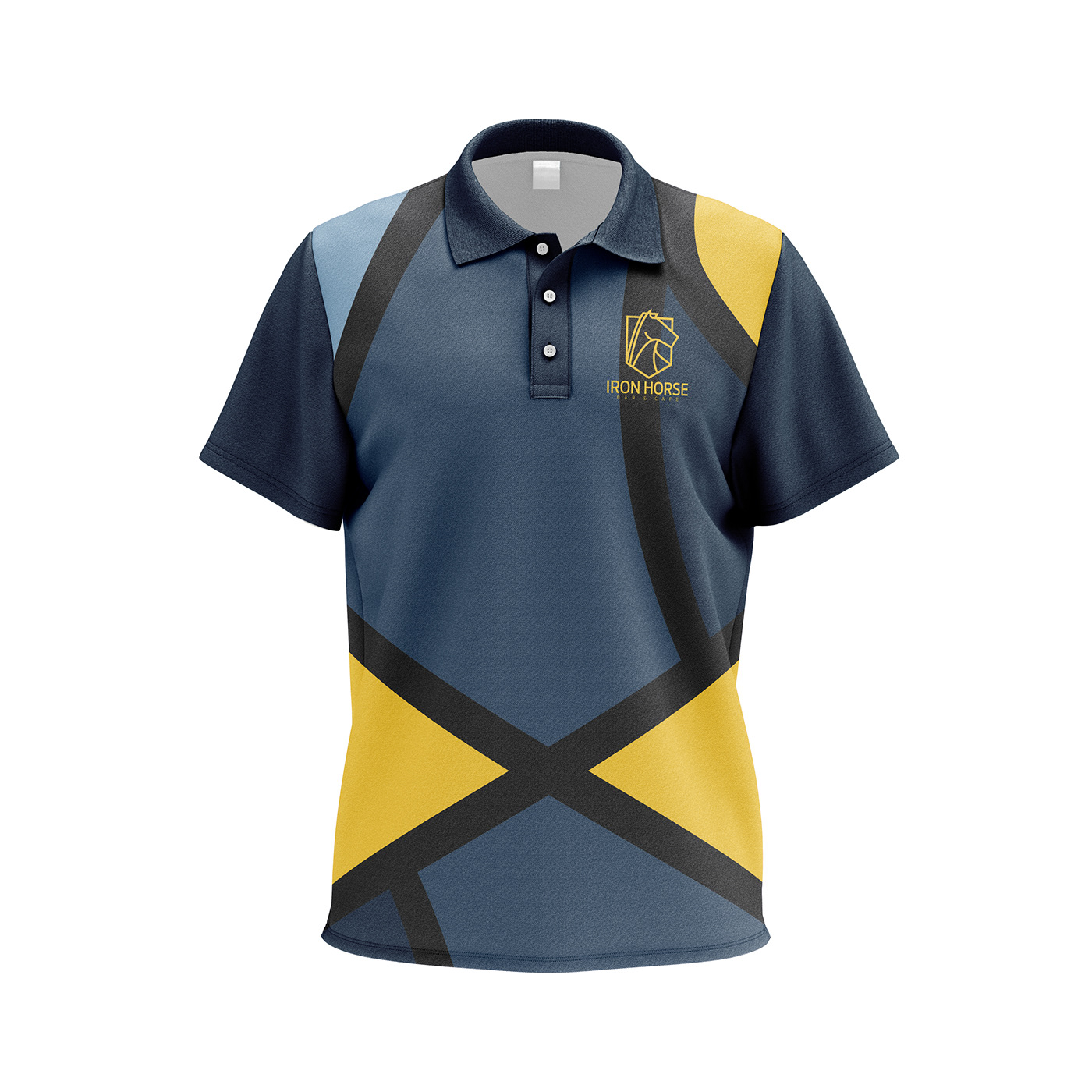
For the branding extensions, I decided to scale up, and in some cases duplicate and rotate the logo so that each product has its own unique pattern while still matching everything else. The Iron Horse logo serves as more than a logo, but also as a way to add vibrance to the restaurants visual identity.


